Commentaires du client:
Hi, 720. This is such a strong submission and I wanted to make sure you saw my previous comments for any final touches before we judge. You can also reach me at mermaid@5perrystreet.com. Here are some final critical comments – we love your work so apologies that these seem “negative,” I’m just trying to give you critical feedback and things you can change in the last hours of the competition to make an even stronger final submission. I’ve also left my initial comments below.
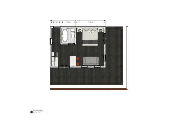
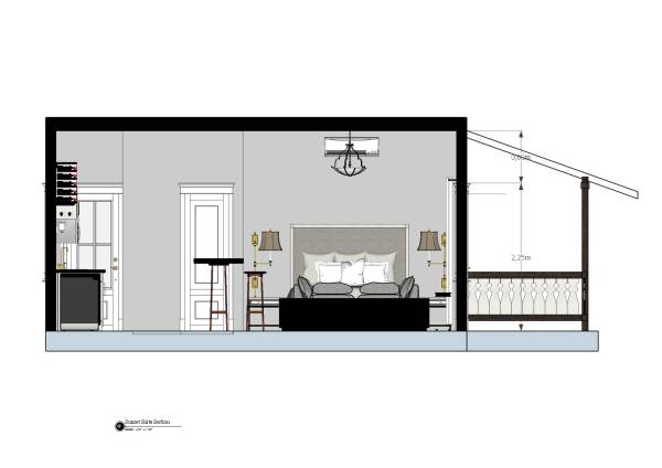
Sunset Suite:
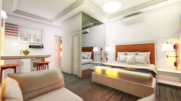
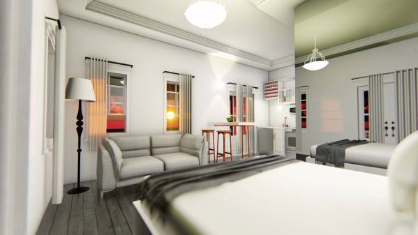
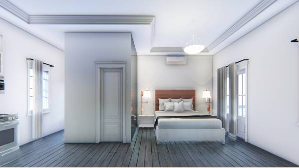
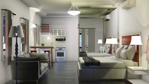
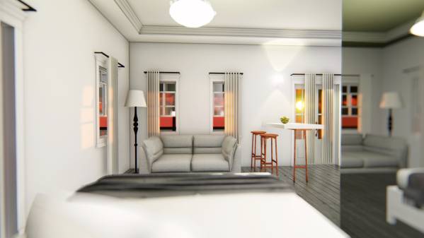
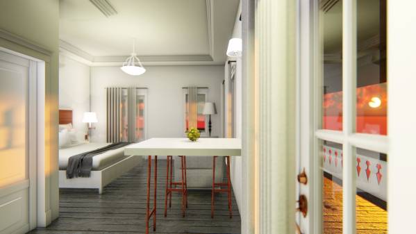
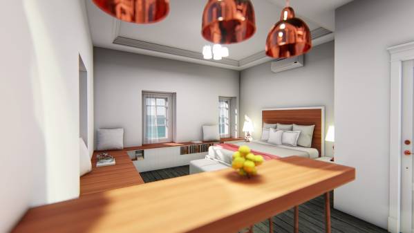
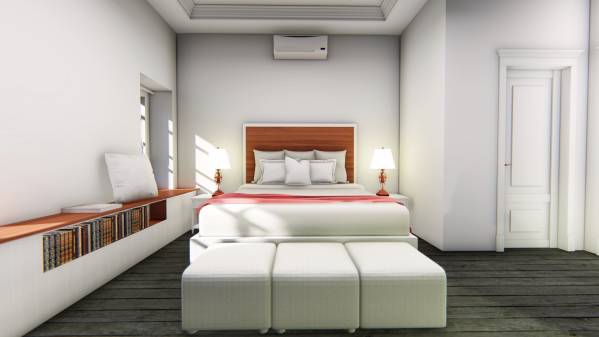
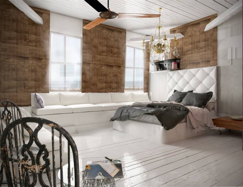
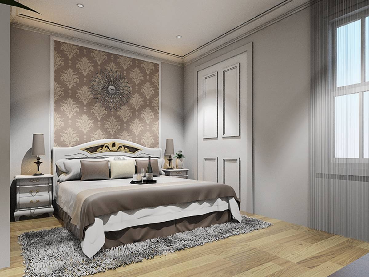
- The room overall is gray, so it looks darker than it should. Make it white or a light cream/off-white so the lighting works better and it looks more appealing.
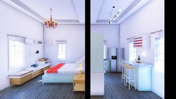
- Switch out bench in front of windows. It doesn’t look elegant enough/looks a little cheap with black & white. Consider an elegant sofa here instead.
- Switch out the gray headboard for the bed. Make it white or wood and more elegant/not so plain.
- No table at end of bed.
- Consider the colors, brightness, and vibrancy in this room. Sunset is a nice touch, but a little too red – possible to make it more yellow? We want to make it a room that a hotel guest wants to walk into.
- Hardwood floors run the other direction (windows/porch/front of building to back)
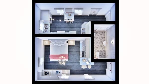
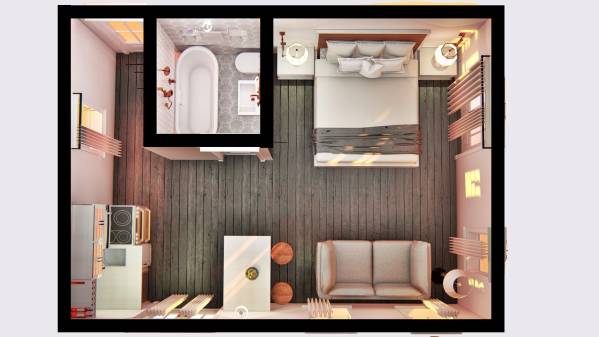
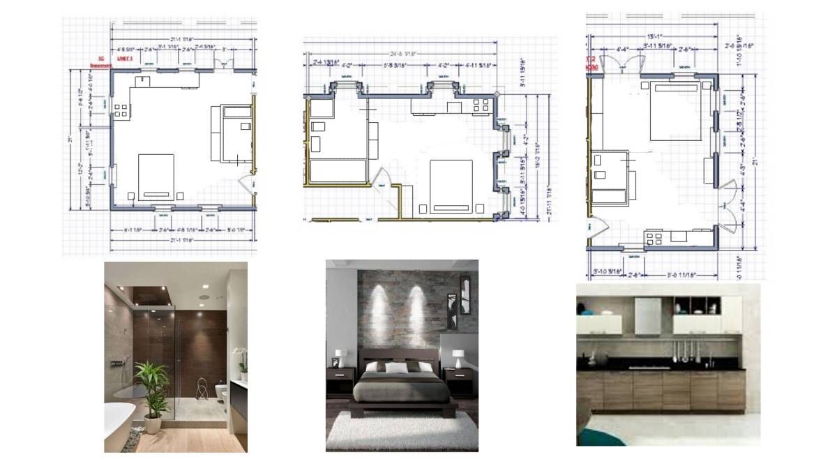
- Overhead/birds eye Plan 28 needs to include wraparound porch in the perspective, Plan 31 overhead needs to include wraparound porch. Guests need to know that the private wraparound porch space is dedicated to this room.
Master Suite:
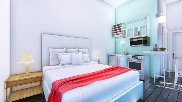
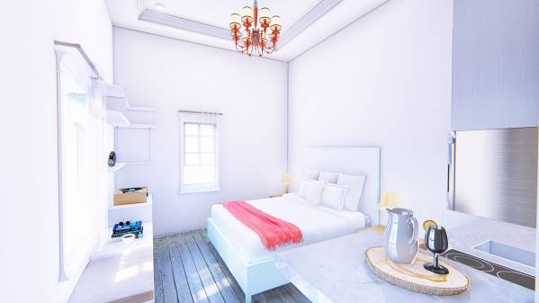
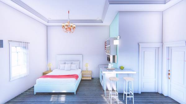
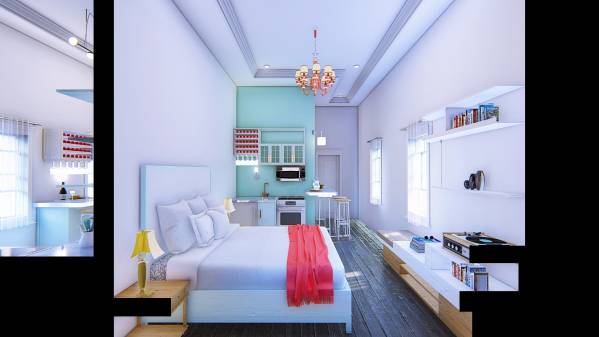
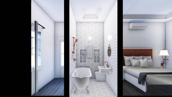
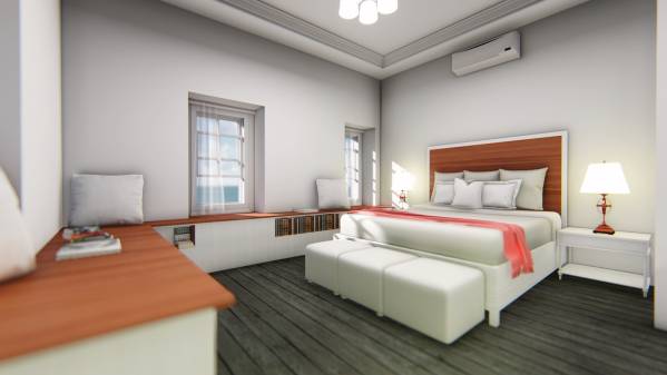
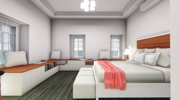
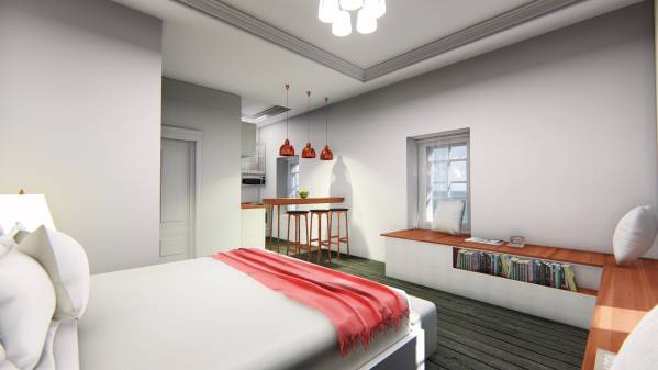
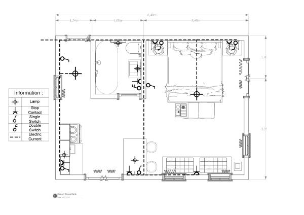
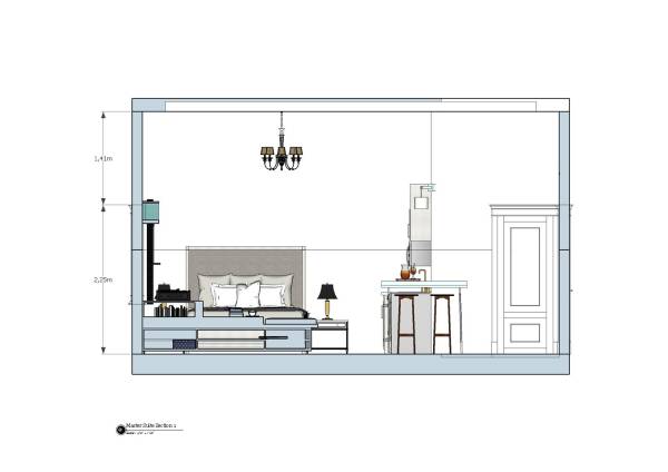
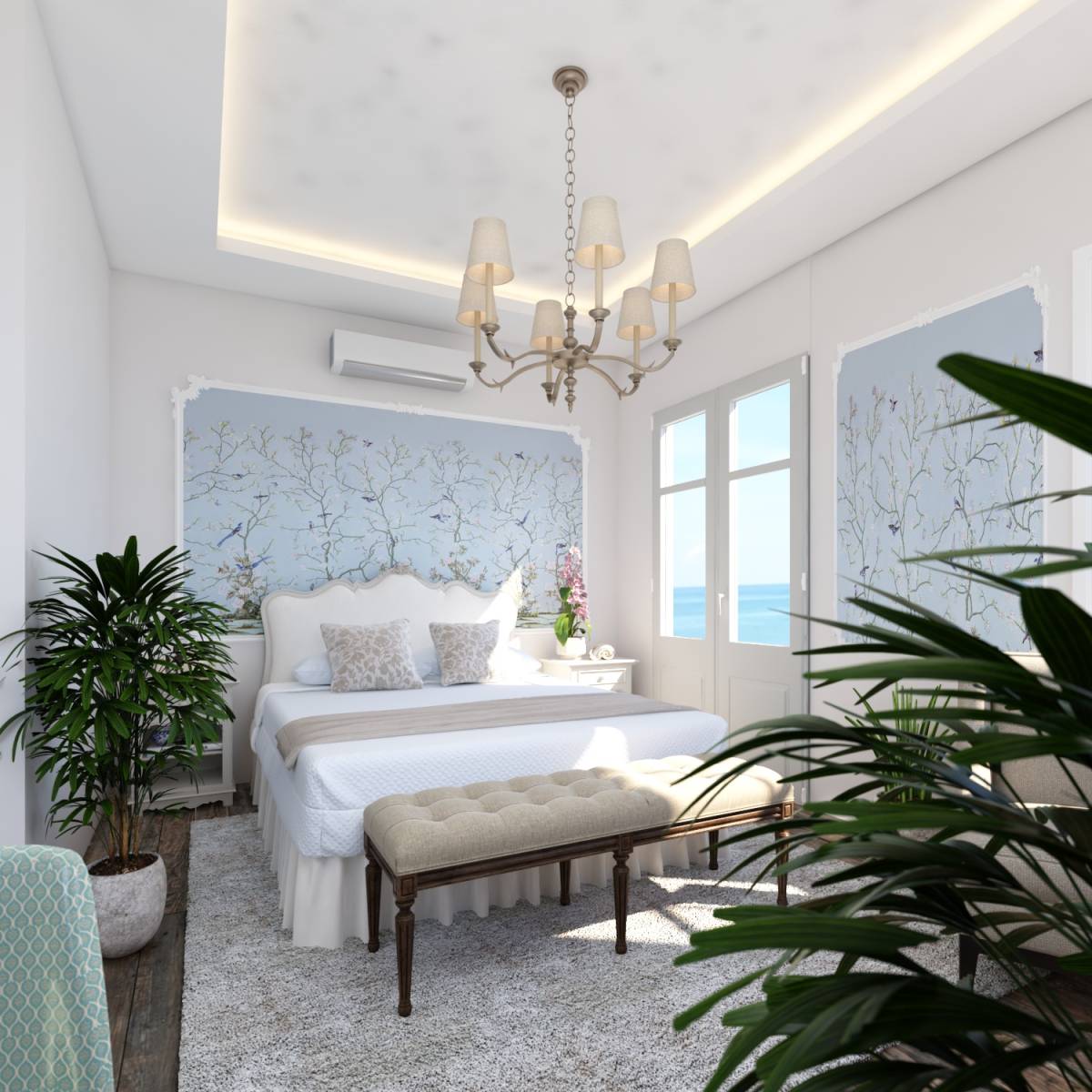
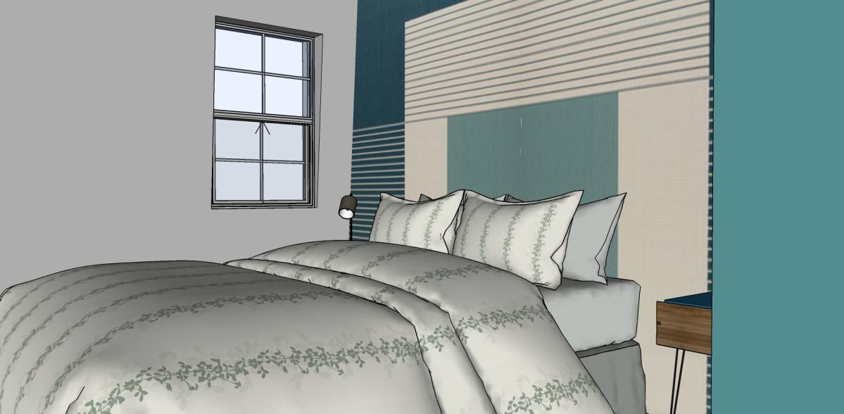
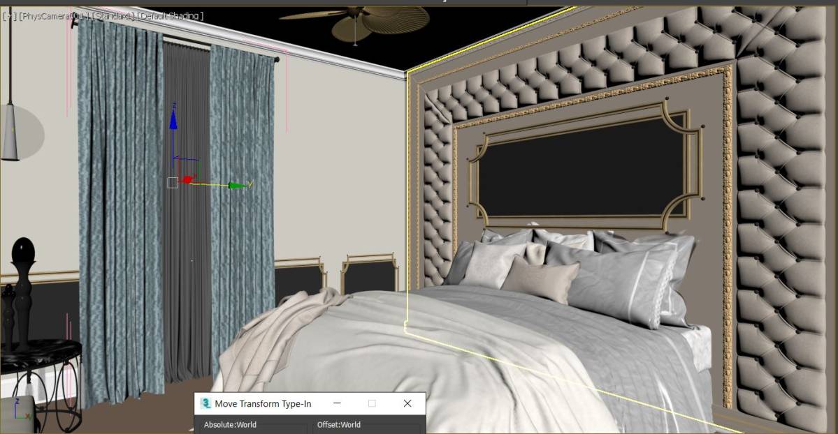
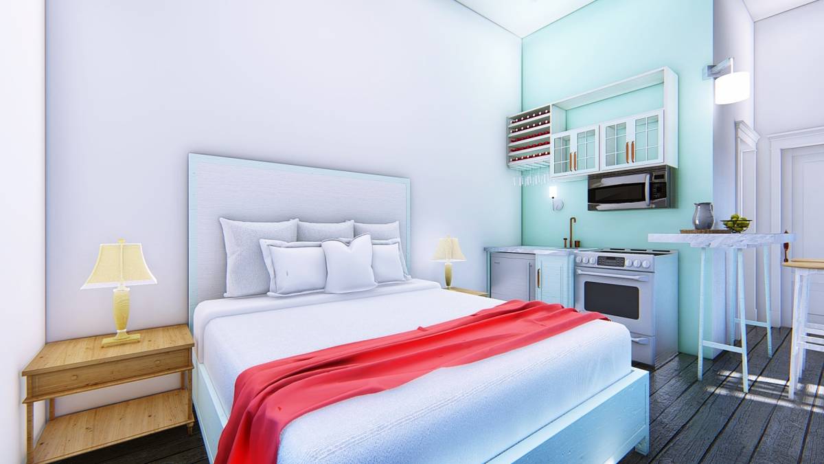
- Seems dark, may need more overhead lighting, too gray, should be brighter. Colors seem bland - try beachy colors, and consider the four colors we’re using for the exterior - can also experiment with other color schemes. Some light aqua/sea mist and some poppy/Intrigue/coral accents may be nice. I like that you have kept it simple with no clashing patterns.
- Consider getting rid of the bench at the end of the bed and using the space along the windows/wall in a more creative way. One designer had a very successful idea of creating wall cabinets there with cut-outs for the windows and a custom bench, creating both a seating area and a storage area/closet/drawers.
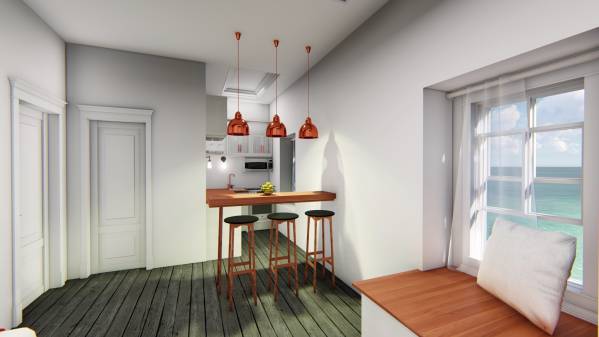
- The entry door into this room will be solid wood, without glass/light.
- No rounded ceiling area for the chandelier, no reflective ceiling material (just matte). Ceiling too stylized, make plain white and one level.
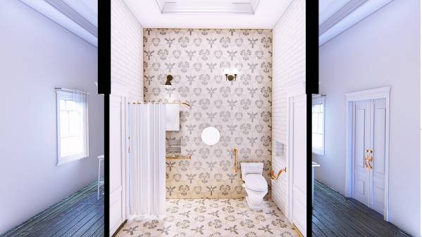
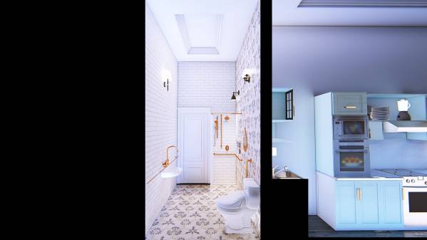
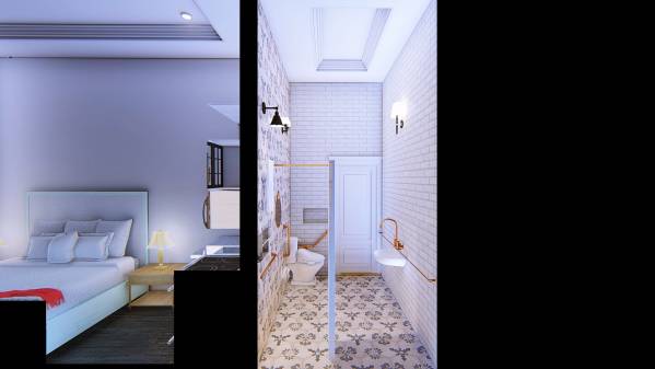
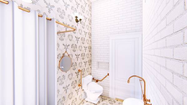
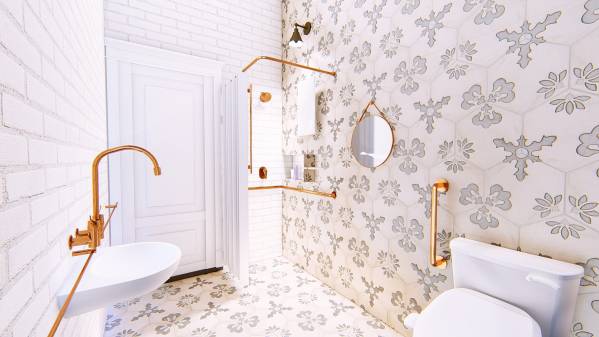
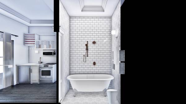
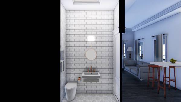
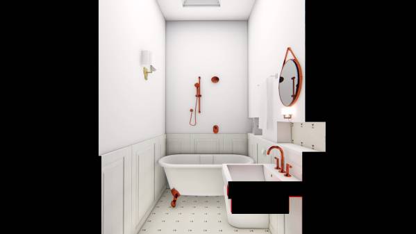
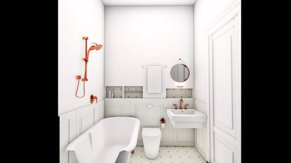
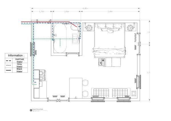
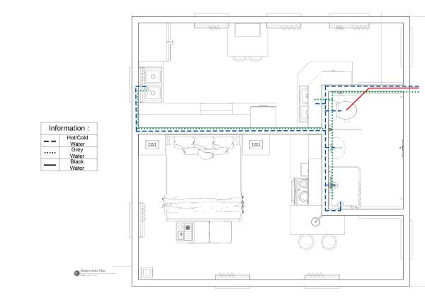
- ADA bathroom is excellent, you understood this better than anyone – only issue is placement of sink and toilet, I made a full entry on the wall about this so please read that.
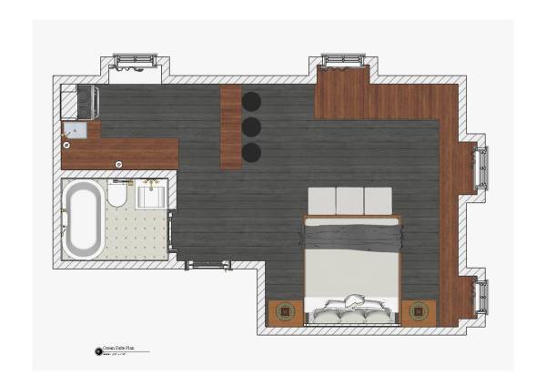
Ocean Suite
This is your weakest room, I prefer the style of the other two suites, but I’d prefer if you spend time on the ones that are working if your time is limited. Issues with this suite are:
- No brick walls in this building, it’s a wooden building.
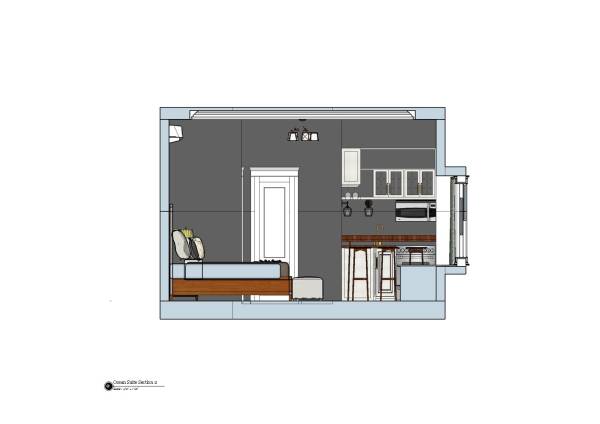
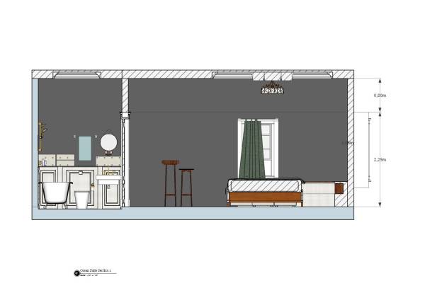
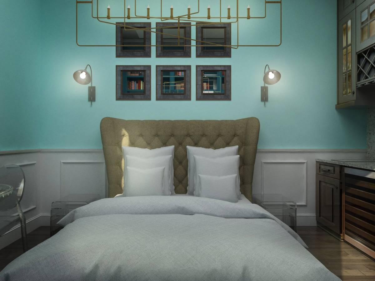
- The gray spackle walls and bookcases look cheap and boring. This does not look like a luxury hotel suite. This room will probably be our most expensive room and will have direct views of the ocean and sunset. People should want to spend their honeymoon in this room…. Change wall colors, change door – no ocean, it’s an interior door. Remove bookshelves. No captain’s wheel, no heavy light fixtures.
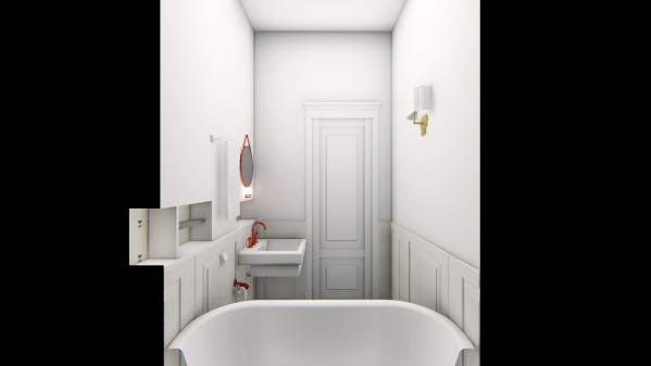
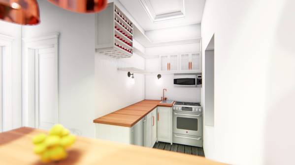
- The kitchenette & bathroom are nice, but again, no gray walls.
Thanks again, 720. Very excited about your submission and your talent. Sorry if this post comes across as negative, just trying to get the final product as strong as it can be.
Kind regards,
Cindy
~
Arc 720, you produced some absolutely lovely renderings! In many ways, you captured details that no other designer perceived from the photos and the floor plans of the building, and you thought of some very creative uses of space. For instance, we are keeping the beautiful original french doors and windows throughout the space. Your designs did the best job of replicating those original windows and doors, which is important because the windows & wood frames must be exactly as they are in the current pictures. The window frames and french door frames are historic/landmarked and the town will not permit changes to anything visible on the exterior of the building. We had to get permits and approvals to change the windows on the third floor (Ocean Suite and other suites on the third floor). The original windows on the third floor had been replaced decades ago with vinyl/aluminum windows that were quite ugly and not historic/period, and we were able to change them out for the new windows displayed there in Ocean Suite now, which were designed on the original windows on the lower floors of the building. Many other designers completely changed the look of the windows and french doors to something modern. Anyway – yours is one of the very top designs in this contest. We love your work!
We are launching a second phase in this competition, and there are only four designers remaining. I will be providing individual comments and some comments for all designers.
For you, here are some initial individual comments:
Master Suite:
- great use of the hardwood floor from the original pictures - we will definitely keep it and restore it.
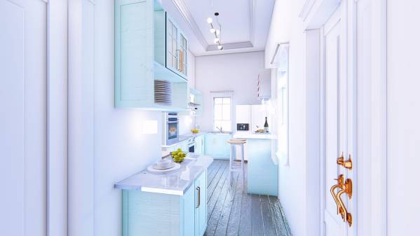
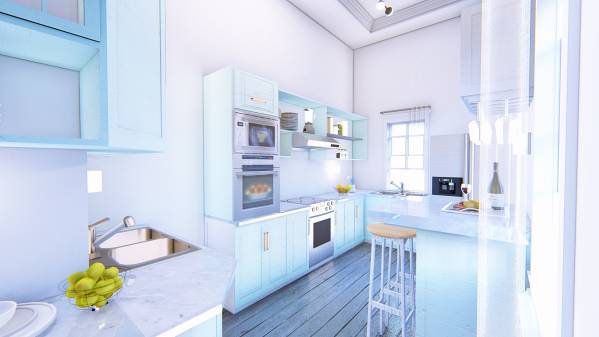
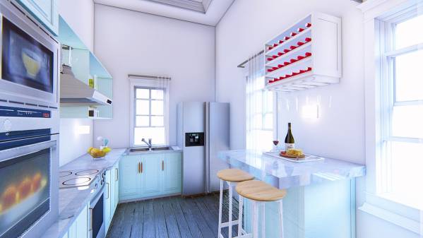
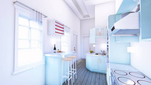
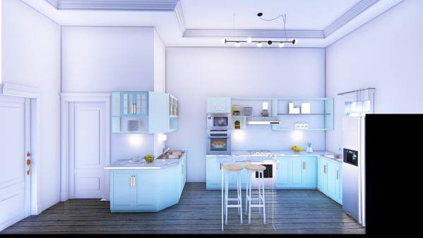
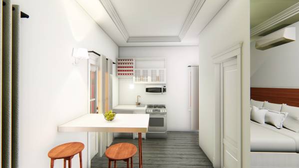
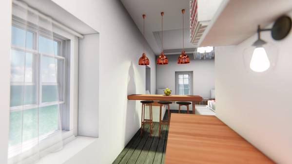
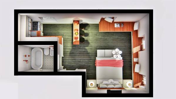
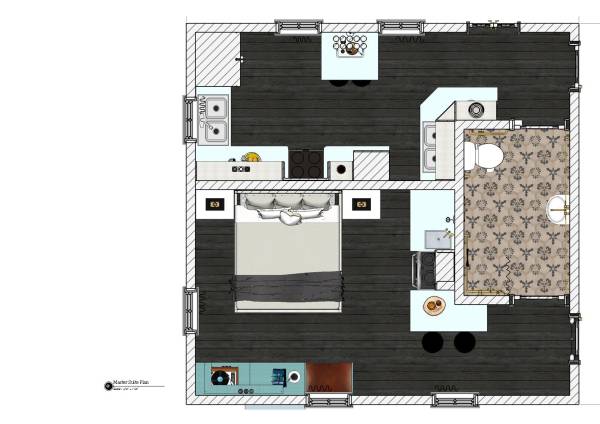
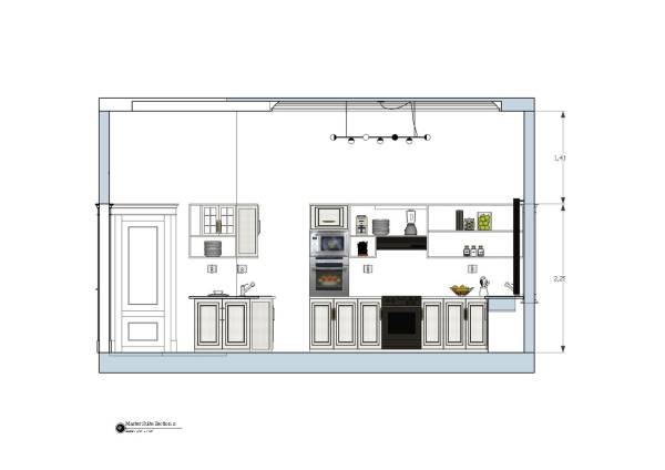
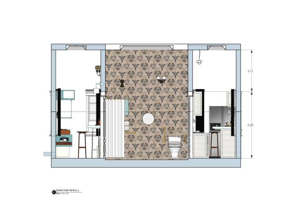
- I like the way you used the kitchen height to make a bar space/hanging glasses along with the upper cabinets, and also used the hall/corridor to add bar stools and a small bar. This was a unique approach and a creative use of space - no one else put a bar/seating area here. Very thoughtful. This is the only handicap accessible room in the building, we we'll just have to make sure there is a 3 foot pathway and that a wheelchair can get through. It looks like it works if the bar stools are tucked under the bar counter. Very clever. :)
- seems dark, may need more overhead lighting
- colors seem bland - try beachy colors, and consider the four we’re using for the exterior - can also experiment with other color schemes.
- consider getting rid of the bench at the end of the bed and using the space along the windows/wall in a more creative way. One designer had a very successful idea of creating wall cabinets there with cut-outs for the windows and a custom bench, creating both a seating area and a storage area/closet/drawers.
- AC is not above the bed in this room, it's the wall next to that - in the corner mounted on the exterior wall - just a nit
- The entry door into this room will be solid wood, without glass/light.
- No rounded ceiling area for the chandelier, no reflective ceiling material (just matte).
Kitchen:
- Nice use of height, bar is clever and great use of space. So is wrap around cabinet near bathroom/entrance.
Sunset:
- Bar counter/seating area is a brilliant use of space. Nice job.
- Consider the colors, brightness, and vibrancy in this room.
- great maintaining hardwood floors – they run the other direction (windows/porch/front of building to back)
Overall, brilliant work and thank you for your attention to detail and great design ideas! Please keep watching the wall for continuing comments and suggestions for design improvements.
Voir la traduction

 3e prix